Ford
2023-Now
Ford makes some of the world’s most iconic vehicles, from the Mustang to the F-150. Over the last few years, we’ve built an in-house product and design org to take Ford.com to the next level. My team owns the vehicle inventory search system, which is a key part of our new ecommerce journey.
Inventory Search Part 1: The Pilot
When I joined Ford, I jumped onto a product team that was building a new inventory search system from scratch. This new “Vehicle Finder Tool” had been designed by an agency, with a few big UX assumptions that were not thoroughly tested. The Vehicle Finder only supported Ford’s electric vehicles, and it was being built alongside our brand-new global data platform. We were truly building the plane as we flew it, aiming for a pilot launch with some of our EV-savvy dealers in the fall of 2023.
To enable our pilot launch, I…
- Adapted the application to work well on desktop (the agency had delivered mobile-only designs)
- Leveraged user testing to identify and fix critical usability issues, including an important “see results” CTA that looked like an ad
- Designed new behaviors to account for edge cases (e.g. “zero results” scenarios and API failures)
- Collaborated with designers from other teams to elevate the app’s visual design

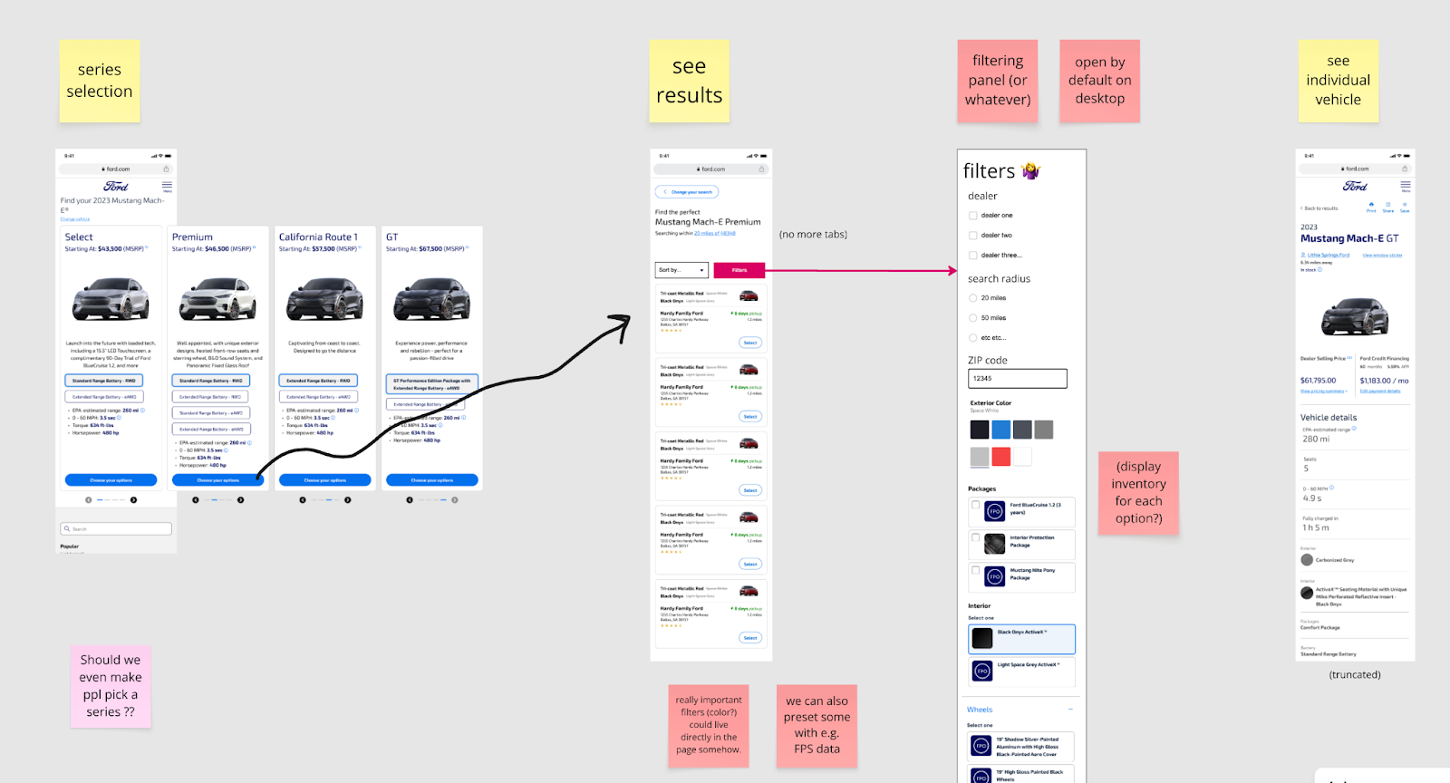
The basic user flow I inherited. Users didn’t realize they could swipe between trim levels on the first screen. Then, users ignored that blue banner at the bottom of the middle screen - including its main CTA to see the list of vehicles!

Part of the user flow that we took into the pilot. Progressive disclosure, usable desktop layouts, and clear CTAs got more users to a relevant vehicle.
The results were somewhat promising. Shoppers found the tool engaging, and the new application was way faster than our legacy inventory system.
However, while the tool felt slick, it didn’t support the way that people actually shop for vehicles:
- The multi-step “wizard” UX locked shoppers into one trim level and battery combo, so it was very difficult to cross-shop and understand the available options.
- Many users were also confused when they configured “their vehicle” and then ended up with a list of vehicles near them, many of which didn’t match their selections. This design mashed up our traditional “build and price” and “inventory search” concepts in a way that didn’t align with anyone’s mental model.
I raised these concerns early in my tenure, and they were gradually confirmed by prototype tests, live product tests, user session recordings, and analytics data.

Matching my early questions and concerns and concerns to user research activities
Early proposal for a “results-first” redesign that would eliminate the confusing “builder” concept and get users to vehicles faster
In addition, with the launch of Vehicle Finder, we now had two separate user flows on Ford.com that both served the same “job to be done” - finding a vehicle on a dealer lot near you. Users had to learn two separate tools to shop for gas vehicles and electric vehicles. This was ultimately because of org politics, legacy systems, and a desire to try something new in the EV world… but our customers don’t care about any of that. They just want to find a dang truck and get on with their lives.
Inventory Search Part 2: From Pilot to Platform
In spring 2024, Ford's priorities shifted, and leadership recognized the need to consolidate our inventory search systems into one modern tool. I had been advocating for this consolidation, and my team was charged with making it happen.
To set my team up for success, I…
- Collaborated with PMs and dozens of stakeholders to define functionality, align on scope, and highlight differences between EV and ICE business rules
- Created low-fidelity artifacts to describe the overall flow for the new system within the broader shopping journey and visualize the cutover plan
- Successfully advocated to remove the confusing "wizard" UX from the Vehicle Finder pilot tool
- Partnered with our UX researcher to test prototypes and early working versions of the new system
- Designed a bunch of functional elements that were missing (filtering refinements, comparison, error states…)

Sharing progress and key UX decisions with leadership
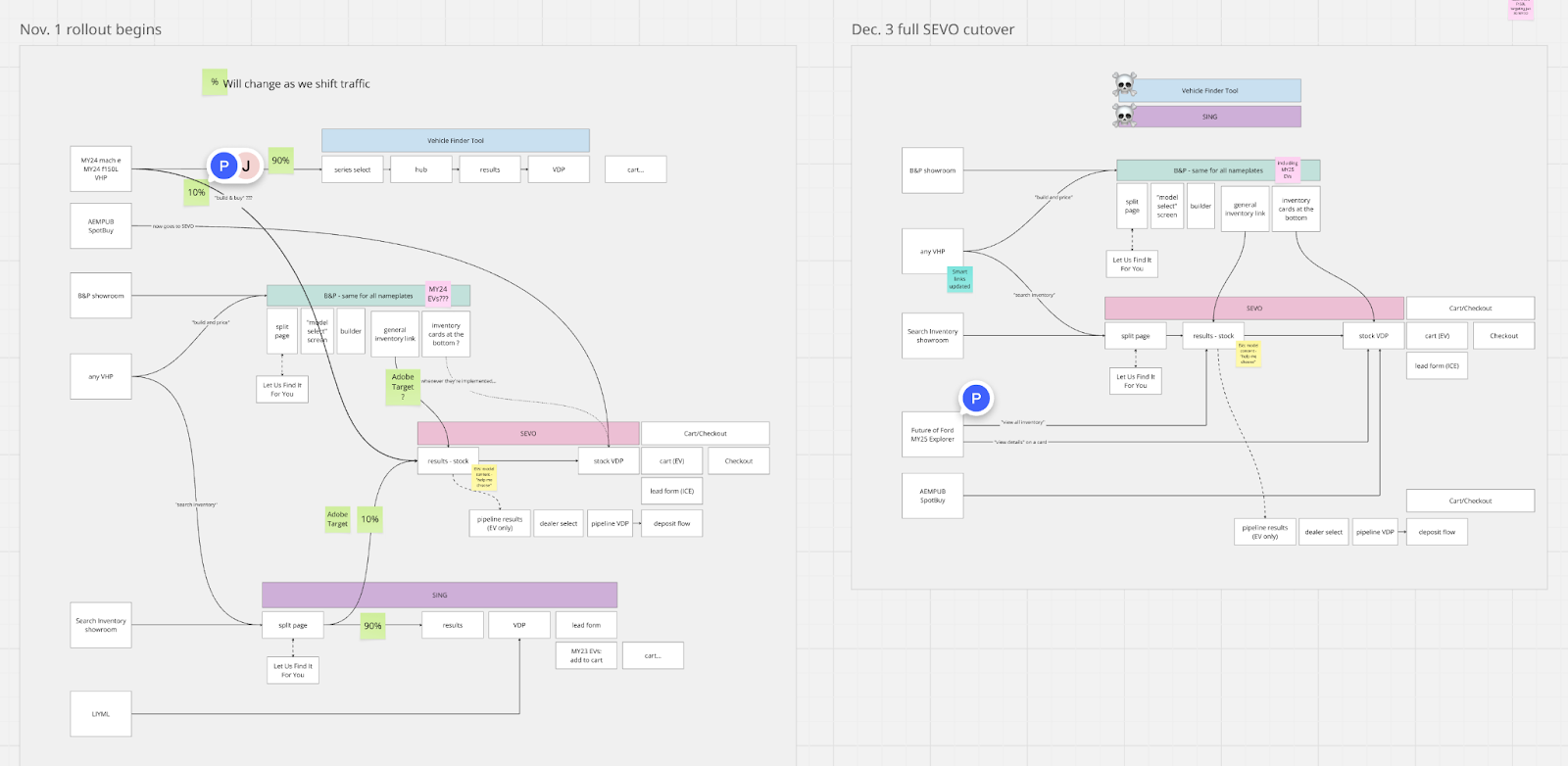
Flow diagrams I created to align on overall user flows and create our transition plan with the Analytics team
Since our launch, I've balanced stakeholder requests with user research findings to enhance the shopping experience. We’ve added new functionality including…
- A towing calculator to provide truck shoppers with essential towing-capacity info
- An enhanced image gallery and 360-degree interior view
- Clarified pricing displays and optimized UI for “next steps” to purchase or contact the dealer
- A nice UI and visual design refresh, which improved responsive behavior and visual hierarchy
We’ll continue to improve this experience as ecommerce rolls out to more dealers throughout 2025. A couple snapshots of the live website are below, but you can also check it out for yourself :)
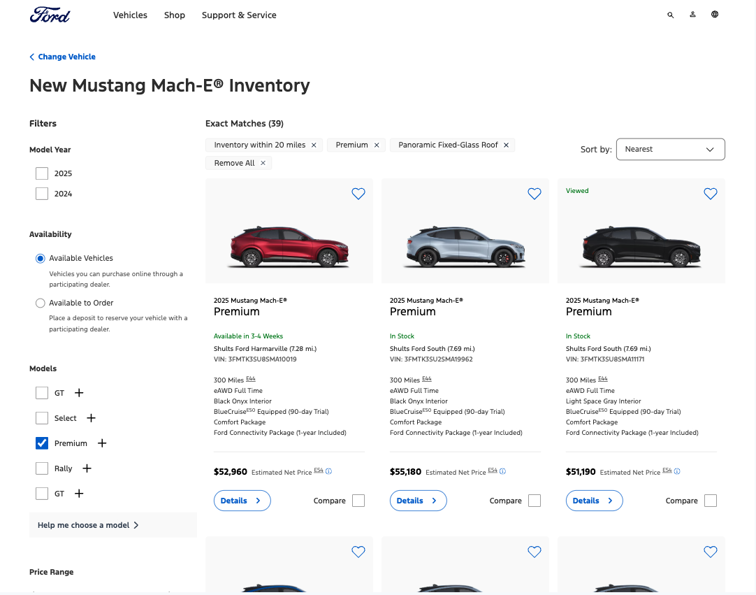
The search results page with a few filters enabled

The vehicle info page for a specific Mustang Mach-E in Pittsburgh