Kiavi
2021-2023
Kiavi provides financing for real estate investors to acquire and renovate America’s aged homes. Most of Kiavi’s customers run their own small business, so they do everything: property sourcing, project management, marketing, even some DIY renovations. Kiavi uses technology to get investors the financing they need - fast.
Navigation Redesign
Kiavi’s main web application is business-critical - it’s the thing that allows our customers to apply for and manage their loans. That’s important! Unfortunately, navigating around the site was confusing:
-
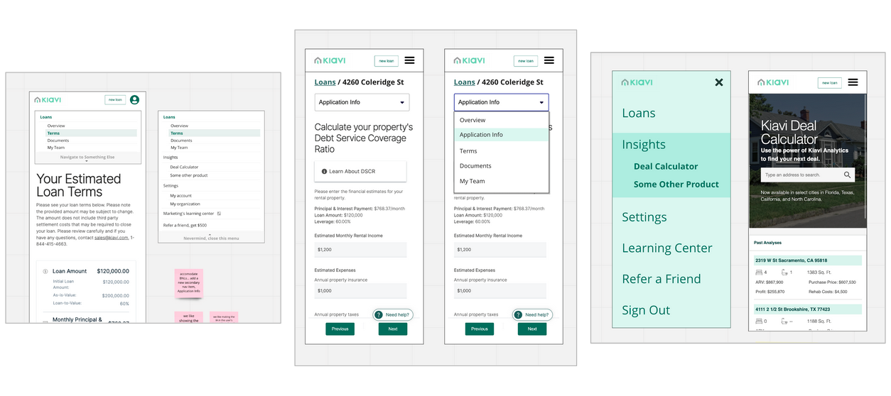
Non-standard UX patterns caused friction when new users try to navigate between loans.
-
Our mobile header conflated global and loan-specific destinations.
- There was no guidance to show users “where they are” within a loan application.
And to make matters worse, tech debt was abundant: there were basically four separate implementations of our app’s header.
Luckily, we my team found some extra space in the roadmap, so we slotted in a quick project to fix this whole thing. I had a couple weeks to get ahead of the dev team, so I jumped right into design, knowing that I would check my work later by testing prototypes and watching a gradual rollout to our users.
The new design would need to...
-
Allow users to navigate in and out of individual loan applications with ease
- Work well on desktop and mobile
-
Clearly show where the user is in our info architecture
-
Emphasize business-critical CTAs (e.g. “apply for another loan”)
-
Express a bit of Kiavi brand presence
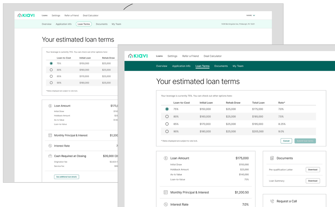
I kicked things off with a quick workshop to get the whole team involved. It quickly became clear that introducing a “secondary navigation” pattern to the loan page would accomplish our main functional goals with minimal engineering complexity. So, we sketched some concepts for new primary and secondary nav patterns.
A few mid-fi concepts that emerged from the sketching workshop.
After agreeing on a direction, I rapidly created many visual design options to explore different expressions of our brand. I also tried a few variations on the desktop design to pressure-test them - for example, a desktop-width band of dark “Earth” green has too much visual impact and distracts from the actual page content. Lastly, I explored some new ways to show which page is currently active. (Click to zoom.)


We synced with our Marketing team to gut-check the branding and learn about their business goals. We also surveyed other parts of our app and similar navigation patterns across the web.
After wrestling with active states, background colors, button hierarchy, link styles, and accessibility checks... here it is:
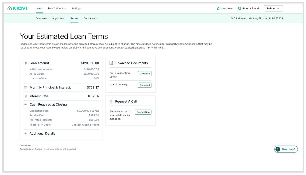 A simple underline shows which page is selected. Our special marketing CTAs float to the right and gain a Kiavi Seafoam icon. The light Seafoam background feels “Kiavi” without dominating the page content.
On mobile, the secondary navigation collapses into a dropdown. It’s visible on every page, so you can tell which part of the loan application you’re looking at, and quickly get to another page. With a bit of cleanup, the simple hamburger menu works just fine for global navigation.
We quickly ran a few usability tests, and the designs passed with flying colors. New and experienced Kiavi users were able to complete their tasks and get around the app with ease.
Is this design rocket science? Heck no. But it fixes the issues, it’s on brand, and it came to life quickly.