JazzHR
2017-2021
JazzHR makes recruiting software for small-to-medium businesses. During my time at Jazz, I was a UX “team of one,” collaborating with two or three PMs and dev teams in any given week. This was my first real gig, and I got to ship a lot of stuff. Shortly after I moved on, JazzHR was acquired by Jobvite, an enteprise sort-of-competitor, forming Employ Inc.
Custom Reporting
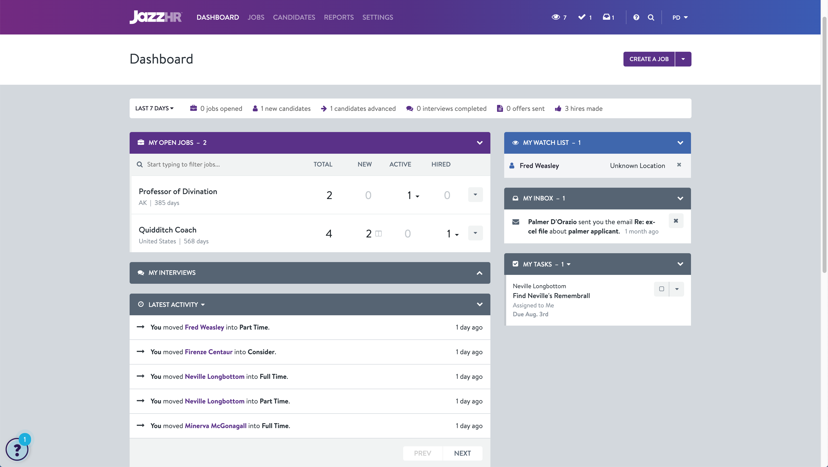
JazzHR’s old custom reporting system was… busted. It let you build queries that didn’t actually run, and I still lie awake at night, trying to figure out the confusing UI.
After some internal discovery, support and usage data analysis, and a review of my past reporting-related research, the solution was clear: nuke Custom Reporting and start over. So that’s what we did.
We were able to borrow some UX patterns from my past work on our main Candidate List and extend them to include capabilities like report sharing and improved filtering. We ran a beta and spent some time with those users, which uncovered another reporting use case that we were able to accommodate in our Workflow Reporting system.
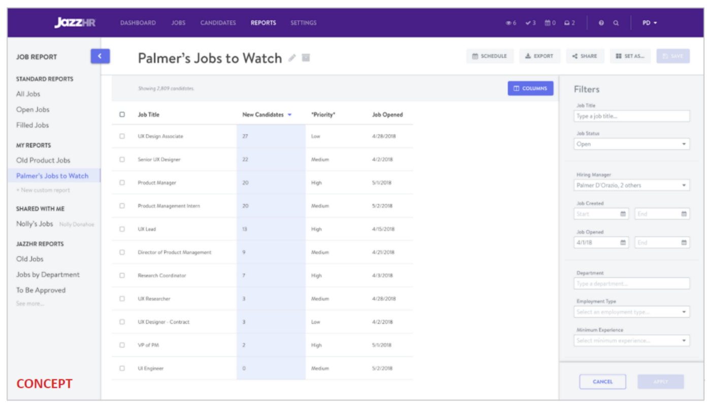
A mid-fi concept with streamlined navigation between reports.

Early wireframes for report sharing. In the old system, you couldn’t
make a report in JazzHR and let another user see it. As you can imagine... folks wanted this.
Now, JazzHR users can get all of their candidate and job data out of JazzHR with ease — no more workarounds. A couple months after release, the project had exceeded our projected business case and reduced reporting-related cancellations to zero.
Whitelabel
Early in 2019, our Partnerships team identified an opportunity to grow our business by offering a “whitelabeled” version of JazzHR. Some of our partners (and prospective partners) wanted the JazzHR UI to reflect their brand, and we discovered that a couple competitors had this capability.
I worked closely with our engineering team to audit all the places in the app that our logo and brand colors show up. Honestly, it wasn’t as much as we expected — mostly the app header, buttons, and some UI related to JazzHR’s customizable workflows. Everything else was pretty neutral. Our brand also appeared in a ton of notification emails.
We were able to distill our brand info down to four colors and two forms of the logo (full-color and white). Long story short, we used CSS Custom Properties to comb through the app for any occurrence of those colors and make them controllable through a config file. Along the way, we knocked out a bit of visual design debt by reducing excess colors (goodbye, hot pink!) and creating a stronger “hierarchy” of button styles.

Part of my button audit that kicked off the Whitelabel project.
We also created a new email template framework, and reduced roughly a zillion unique emails down to a few templates. This was amazing, hard work from this sprint team — this was a slog, but we’ll never have to do it again.
This was a weird project because the “design” work was very subtle, and it was driven by business goals rather than user research. I suppose in this case our users were our partners, and we did spend a lot of time talking to them early on. Along the way I created a style guide document for prospective partners and recorded some feedback for possible iterations.
Last but not least, I also designed an internal tool to help our Partnerships team get more of these Whitelabel accounts up and running.